If I have learned anything about design over the past years, it is that art requires both passion and patience. The fact of the matter is… good art takes time! Sometimes art takes a lot of time. Whenever impatience strikes, I have to remind myself that the Sistine Chapel wasn’t painted in a day nor were the pyramids built in a week. True, inspired art is fueled by passion, but it is fostered through patience.
Finding Your Identity
In a society driven by media, design is vital to representing your organization. Having an effective logo, branding, and identity is critical to maintaining a presence that evokes confidence and ignites passion within your supporters, volunteers, and advocates. A logo is the face of an organization. It is so much more than simply a pretty icon that people associate with your business or service; it’s your identity. A wise mentor once told me, “The goal of a logo is to boil an idea down to its simplest form.”
Why do logos take 40 hours to create? The answer is simple because this task of boiling an idea down to its purest form and then creating art that reflects that essence is very strenuous.
Proving the Process
For designers creating a logo can be a daunting task, especially when the mission of the organization you are representing seems so much bigger than what could fit into a simple design. Where do you start?
The first aspect that you must consider is that a brand’s purpose is bigger than just beauty. To create an artistic representation you have to start with what makes that organization who they are, what’s their purpose, their mission. At Media Change this process starts with a questionnaire. Before the art pen hits the style pad we begin by asking questions like:
• What is your organization’s mission?
• Who do you serve?
• What goals do you have?
After we get a completed questionnaire in our hands, then we hit the drawing board. This is where the task of creating a logo becomes challenging and exciting. This is where you take these ideas and start to boil them down to their essence.
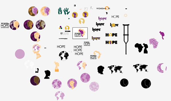
The image above is what a typical Adobe Illustrator art-board looks for me at the beginning of this process, one big swirl of ideas. The best way to develop an idea is to ask yourself what words, themes, or symbols stick out to you? Start there.
A logo not only needs to be simple, vibrant, and eye-catching its also needs to convey a certain amount of information about that organization. Creating symbols that answer questions like:
• What do they do?
• Who do they serve?
• Where do they serve?
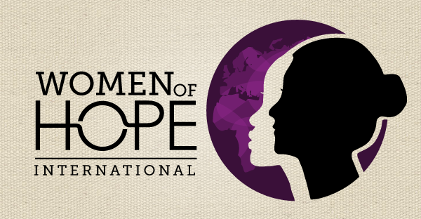
One ministry I have had the privilege of working on a logo with is Women of Hope International. They are based out of Sierra Leone and serve disabled women. To create a logo that represented their phenomenal mission, I had to take into account their heart and mission. Hope was a word that continually resonated with me, so it was very important that this theme resonated with anyone who interacts with the logo. Also incorporating elements that convey where and who they serve gives anyone interacting with the logo immediate information about Women of Hope.
Communication is Key
One of the most important aspects to any design project is to have the client and the designer communicate with each other. We’ve all heard the adage, “Communication is key,” but when it comes to working with clients to create media they’ll love, this statement couldn’t be more true. One thing that I’ve learned to embrace when designing media is revisions. Some of the best ideas are created from feedback you get from your clients.
As a designer it is so easy to take so much pride in your work that client feedback can be processed as little jabs at your artistry. Learning to separate yourself from the media you create is vital to pushing your art to next level. This is another facet of the process that requires the utmost patience. Round after round of revisions to a piece you’ve spend hours of hard-work on can be mentally taxing, but taking a step back from a project and viewing feedback through a fresh lens can sometimes be exactly what your design needs to be complete. Allow yourself to be open to what your client has to say because chances are they see things differently from the pixel-oriented minds of designers.
The Finished Product
Logos are organic, they tend to grow and develop in directions that sometimes even surprise you as the designer. The trick to this is fostering that natural development. Having effective communication lines of feedback with your client is huge to creating a final product that everyone is excited about. Allow yourself to be open to where the client’s feedback leads and how it may develop in your design. No one knows an organization’s mission better than they do, so allow your client to participate in the process.
After 9 rounds of revisions… we finally settled on this logo. Here is what the completed art board looks like
Not the Sistine chapel perhaps, but I think we captured their heart.


12:13 pm
Awesome! I love it!